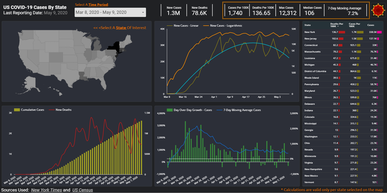
During these uncertain times, how can you make sense of the data tsunami being presented on the state of pandemic in US? For the last couple of months, many Americans found themselves checking the spread of COVID-19 cases on a daily basis. As most of US states went into shelter-in-place mode, resources like Johns Hopkins and 91-DIVOC became a daily refuge for those seeking to stay informed. In today’s post, we will work on creating our own version of a web-based, interactive and visually appealing COVID-19 dashboard using Google DataStudio. Doing so we will gain a better understanding of the data used, decide on the type of data we deem most relevant, and maintain control over the best ways to visualize such data to help our audience make most sense of it. In the process of building this data viz, we will utilize various objects and features of the mighty GDS application: Google Sheets connector, Calculated fields, Scorecard, Table, Geo Map, Line and Combo charts, Date range, Filter controls and recently released optional metrics – are some but not all features we will cover.
Continue readingCategory: Data
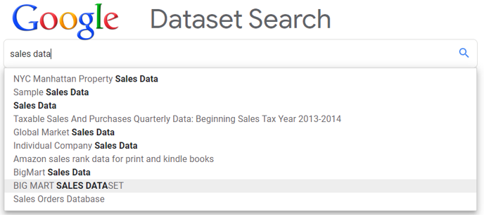
Get acquainted with Google Dataset Search.
Google has been dominating web search for nearly two decades and it’s acquisition of YouTube resulted in the second most popular search engine in the world. Yet, it seemingly lost the product search niche to Amazon. It’s not surprising that amidst growing interest in all things data, including public and open data, this tech giant would be keen on developing a search product geared towards making dataset search easier. What is surprising, is how long it took them to develop and release this product, which was officially introduced to general public on January 23rd, 2020 after spending more than 16 months in beta testing. You can embark on your own dataset search journey here.
Continue readingQlik Sense : First impressions, using Survey of Business Owners data
First Impressions of using Qlik Sense cloud, using Survey of Business Owners data

There is certainly no shortage of various data visualization and BI tools on the market. On this blog we’ve already covered Tableau and Power BI , it’s time for us to review their competition, another leader on Gartner’s Magic Quadrant for Analytics and BI platforms: Qlik , which offers a suite of different BI tools. For the purposes of this post let’s focus on their web-based free product: Qlik Sense – Cloud. Most of the modern data viz programs are supposed to be rather intuitive and very easy to use; so I decided to play with this program without going through the trouble of learning to use it first. American data finder had just the right data set for this experiment: Survey of Business Owners data, which among other things can help us quantify number of companies by size and owner’s gender, see if male vs. female-owned organizations earn higher revenue, employ more workers, and/or pay higher salaries to their employees. Let the data discovery journey begin.
Working with sample BigQuery tables
Working with sample datasets in BigQuery

In the previous post we added public tables to our BigQuery interface. However, Google already provides sample data on various topics by default. While most of these tables are not updated, they still present some interest in terms of learning trends or insights on a multitude of topics. We will focus on 3 of these tables:
Natality (daily US births from 1969 to 2008),
GSOD (daily weather information by a station number from 1929 to 2009),
and Shakespeare (word index of Shakespeare’s works.)
Let’s start our exploration with the Natality dataset. The graph above charts share of teenager births, comparing to grand total by year. Between 1969, nominal number of births by teenagers went up from 307,561 to 441,110. However, this is not necessarily a bad news, considering growing US population. While in 1973, almost every fifth birth (19.55%) was by a teenager mother, by 2005 this ratio dropped to every 10th birth (10.18%.) To pull relevant source data, we simply need to run the following query (which would incidentally retrieve preteen births as well [outliers representing fewer than 200 births a year.]):
Continue reading

