Table Joins

Understanding Table Joins in SQL

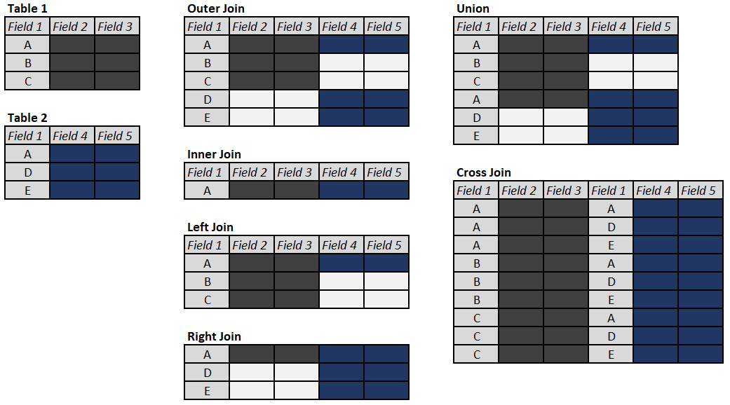
Working with data often involves the need to utilize multiple data sources, usually stored in different data tables (in case of database storage) or data frames (when it comes to programming languages or data visualization tools.)  In order to put power of this data to a good use we want to be able to join these tables based on a field or fields they have in common (foreign key[s]) or sometimes values in the field that are different. Not only basic principles of table joins – INNER, OUTER (FULL, LEFT, and RIGHT), CROSS (or Cartesian) or even UNION-ing tables are universal to most relational databases and flavors of SQL, they also apply to working with data frames. In this post we will explore examples of using these table joins in a PostgreSQL database, while adding SELF, and LEFT/RIGHT exclusive joins for a good measure.

Continue reading

US COVID-19 Cases

During these uncertain times, how can you make sense of the data tsunami being presented on the state of pandemic in US? For the last couple of months, many Americans found themselves checking the spread of COVID-19 cases on a daily basis. As most of US states went into shelter-in-place mode, resources like Johns Hopkins and 91-DIVOC became a daily refuge for those seeking to stay informed. In today’s post, we will work on creating our own version of a web-based, interactive and visually appealing COVID-19 dashboard using Google DataStudio. Doing so we will gain a better understanding of the data used, decide on the type of data we deem most relevant, and maintain control over the best ways to visualize such data to help our audience make most sense of it. In the process of building this data viz, we will utilize various objects and features of the mighty GDS application: Google Sheets connector, Calculated fields, Scorecard, Table, Geo Map, Line and Combo charts, Date range, Filter controls and recently released optional metrics – are some but not all features we will cover.

Continue reading


A beginner’s Guide to BigQuery Sandbox and exploring public datasets.

A beginner's guide to BigQuery Sandbox

          As you might realize by now, writing SQL queries is one of the essential skills any inspiring data analyst needs to master. After all, larger datasets are typically stored in relational databases and Structured Query Language is the language that helps us communicate with such databases. Sure, NoSQL is gaining prominence amid the growing popularity of nontraditional databases, but we need to learn to crawl before we start walking. Merely 10 years ago, you would need to download and install a RDBMS software package (be it MySQL, PostgreSQL, or SQLite), load a sample database and do a hundred pushups before you could write your very first SQL query. Luckily technology sprung ahead and we now have a plethora of web-based SQL editor options from SQL Lite Online to SQL Fiddle that eliminate the software setup step, but might still require us to load sample data. What if you wanted to access real-world big data sets from the comfort of your browser without having to download any software, no hassle, no trial, no credit card required? Well, you’re in luck, what follows is the beginner’s guide to Google BigQuery’s Sandbox. An active Google account is your cost of admission. BONUS: Machine Learning models are powered by nothing else but SQL are also included.
Continue reading

First Impressions of using Qlik Sense cloud, using Survey of Business Owners data


First Impressions of using Qlik Sense cloud, using Survey of Business Owners data.

          There is certainly no shortage of various data visualization and BI tools on the market. On this blog we’ve already covered Tableau and Power BI , it’s time for us to review their competition, another leader on Gartner’s Magic Quadrant for Analytics and BI platforms: Qlik , which offers a suite of different BI tools. For the purposes of this post let’s focus on their web-based free product: Qlik Sense – Cloud. Most of the modern data viz programs are supposed to be rather intuitive and very easy to use; so I decided to play with this program without going through the trouble of learning to use it first. American data finder had just the right data set for this experiment: Survey of Business Owners data, which among other things can help us quantify number of companies by size and owner’s gender, see if male vs. female-owned organizations earn higher revenue, employ more workers, and/or pay higher salaries to their employees. Let the data discovery journey begin.

Continue reading