US COVID-19 Cases

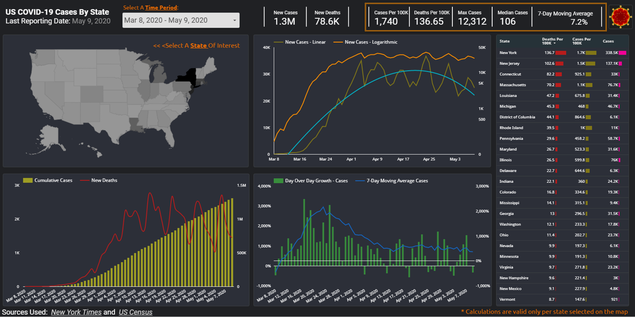
During these uncertain times, how can you make sense of the data tsunami being presented on the state of pandemic in US? For the last couple of months, many Americans found themselves checking the spread of COVID-19 cases on a daily basis. As most of US states went into shelter-in-place mode, resources like Johns Hopkins and 91-DIVOC became a daily refuge for those seeking to stay informed. In today’s post, we will work on creating our own version of a web-based, interactive and visually appealing COVID-19 dashboard using Google DataStudio. Doing so we will gain a better understanding of the data used, decide on the type of data we deem most relevant, and maintain control over the best ways to visualize such data to help our audience make most sense of it. In the process of building this data viz, we will utilize various objects and features of the mighty GDS application: Google Sheets connector, Calculated fields, Scorecard, Table, Geo Map, Line and Combo charts, Date range, Filter controls and recently released optional metrics – are some but not all features we will cover.

Continue reading

Learning to use data visualization programs


Gartner Magic Quadrant for data visualization programs

          Imagine spending countless hours analyzing your data and finding a meaningful insight that can help shape direction of your business – the only missing piece is convincing functional stakeholders that your analysis is in fact valuable. In this article we will discuss learning resources offered by leading tools that help us communicate our data findings. In fact, no analysis no matter how thorough and complex it might be could yield any real value if the compelling recommendation is not provided to help company leadership take further action. This is exactly where data visualization comes into play: this software allows us to connect to disparate data sources, wrangle our data, perform ad-hoc analyses, distill a powerful data story and even build dashboards to enable further analysis by other folks in our organizations.

          According to Gartner’s Magic Quadrant for Analytics and Business Intelligence Platforms (1) the list of leaders in the data visualization fields include Microsoft Power BI, Tableau and Qlik . In an apparent effort to grow their user base and democratize data analytics, all of these providers offer fully functional versions of their programs free of charge or in case of Microsoft with an affordable subscription plan. Even better, these vendors formalized their knowledge base via various free online learning options.
Continue reading