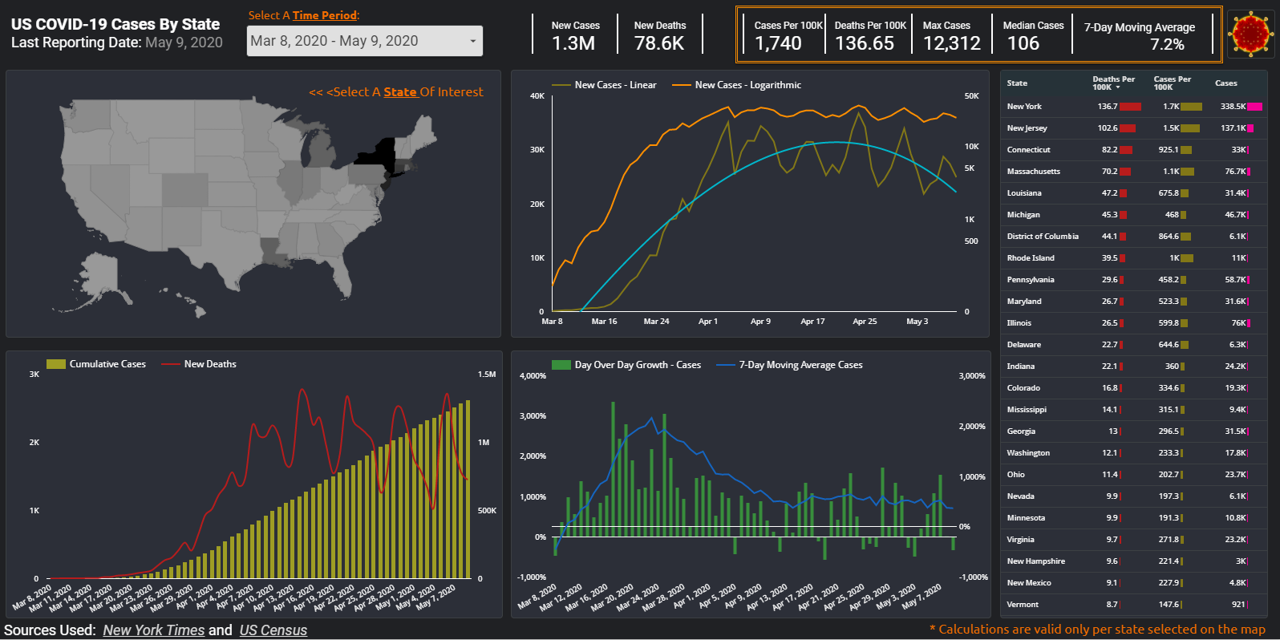
During these uncertain times, how can you make sense of the data tsunami being presented on the state of pandemic in US? For the last couple of months, many Americans found themselves checking the spread of COVID-19 cases on a daily basis. As most of US states went into shelter-in-place mode, resources like Johns Hopkins and 91-DIVOC became a daily refuge for those seeking to stay informed. In today’s post, we will work on creating our own version of a web-based, interactive and visually appealing COVID-19 dashboard using Google DataStudio. Doing so we will gain a better understanding of the data used, decide on the type of data we deem most relevant, and maintain control over the best ways to visualize such data to help our audience make most sense of it. In the process of building this data viz, we will utilize various objects and features of the mighty GDS application: Google Sheets connector, Calculated fields, Scorecard, Table, Geo Map, Line and Combo charts, Date range, Filter controls and recently released optional metrics – are some but not all features we will cover.
Continue readingTag: DataViz
Learning to use data visualization programs
Learning to use data visualization programs

Imagine spending countless hours analyzing your data and finding a meaningful insight that can help shape direction of your business – the only missing piece is convincing functional stakeholders that your analysis is in fact valuable. In this article we will discuss learning resources offered by leading tools that help us communicate our data findings. In fact, no analysis no matter how thorough and complex it might be could yield any real value if the compelling recommendation is not provided to help company leadership take further action. This is exactly where data visualization comes into play: this software allows us to connect to disparate data sources, wrangle our data, perform ad-hoc analyses, distill a powerful data story and even build dashboards to enable further analysis by other folks in our organizations.
According to Gartner’s Magic Quadrant for Analytics and Business Intelligence Platforms (1) the list of leaders in the data visualization fields include Microsoft Power BI, Tableau and Qlik . In an apparent effort to grow their user base and democratize data analytics, all of these providers offer fully functional versions of their programs free of charge or in case of Microsoft with an affordable subscription plan. Even better, these vendors formalized their knowledge base via various free online learning options.
Continue reading
Qlik Sense : First impressions, using Survey of Business Owners data
First Impressions of using Qlik Sense cloud, using Survey of Business Owners data

There is certainly no shortage of various data visualization and BI tools on the market. On this blog we’ve already covered Tableau and Power BI , it’s time for us to review their competition, another leader on Gartner’s Magic Quadrant for Analytics and BI platforms: Qlik , which offers a suite of different BI tools. For the purposes of this post let’s focus on their web-based free product: Qlik Sense – Cloud. Most of the modern data viz programs are supposed to be rather intuitive and very easy to use; so I decided to play with this program without going through the trouble of learning to use it first. American data finder had just the right data set for this experiment: Survey of Business Owners data, which among other things can help us quantify number of companies by size and owner’s gender, see if male vs. female-owned organizations earn higher revenue, employ more workers, and/or pay higher salaries to their employees. Let the data discovery journey begin.
Employment Trends in 2014 INC 5000 List
Where are the jobs? 2014 INC 5000 List might provide some answers…
What do Domino’s Pizza, Microsoft, Timberland, Tough Mudder, Intuit, Vermont Teddy Bear, E*Trade, Lending Club, Morningstar, Oracle, Fuhu, Cold Stone Creamery, Under Armour, and GoDaddy have in common? They all have appeared on Inc Magazine’s INC 500 list of the fastest-growing American private companies. Looking at the last year’s INC 5000 list might help us draw employment insights and identify best industries and places to look for a job. By definition, these company are experiencing tremendous growth, and as such, could be representative of future job opportunities in the US. In addition, according to Forbes , small businesses added over 65% of the net new jobs in the past two decades. So, where are the jobs?! Based on INC 5000 data, Chicago, IL employs over 5% [56,813] of all INC 5000 workers. Another 14% [144,847] of INC 5000 employees work in California. Top 3 industries by employment include: Human Resources, Business Products & Services, and IT Services . Together, they are responsible for almost 400,000 jobs, or 38% of the grand total.

